
Why You Need a Responsive Website: Benefits and Features
In today’s fast-paced digital world, having a strong online presence is not just an option—it’s a necessity. As more users access the internet via various devices, the importance of a responsive website cannot be overstated. At Webbirth, we specialize in creating websites that are not only visually stunning but also responsive, ensuring they perform seamlessly across all devices. But what exactly is a responsive website, and why should you choose Webbirth for this crucial service? Let’s dive into the benefits and features of responsive web design.
What is a Responsive Website?
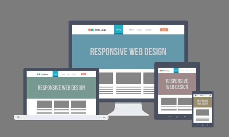
A responsive website is designed to adapt its layout and content based on the screen size and orientation of the device being used. Whether your visitors are using a smartphone, tablet, laptop, or desktop computer, a responsive website ensures they have an optimal viewing experience. This adaptability is achieved through flexible grids, layouts, and images, along with the use of CSS media queries.
The Benefits of a Responsive Website
1. Improved User Experience
- Seamless Navigation: A responsive website provides an easy-to-navigate interface, reducing the need for zooming or horizontal scrolling.
- Consistency Across Devices: Visitors will experience a consistent look and feel whether they access your site from a mobile device or a desktop computer, enhancing their overall experience.
2. Increased Mobile Traffic
- With more than half of all web traffic coming from mobile devices, having a responsive website ensures you’re not missing out on a significant portion of your audience. A mobile-friendly design helps you capture and retain these users.
3. Better SEO Performance
- Google favors responsive websites when ranking search results. A responsive design helps improve your search engine rankings, making it easier for potential customers to find you online.
4. Faster Loading Times
- A responsive design optimizes images and other content for faster loading on all devices. This speed not only improves user experience but also boosts your search engine rankings, as Google considers page load time a key factor in SEO.
5. Cost-Effective and Easier Maintenance
- Instead of creating separate websites for mobile and desktop users, a responsive website consolidates your efforts into one site. This approach reduces the time and cost associated with maintaining multiple versions of your website.
6. Higher Conversion Rates
- A consistent and seamless user experience across all devices translates into higher conversion rates. Users are more likely to engage with your site, fill out forms, make purchases, or contact you when they have a positive experience on your website.
Key Features of a Responsive Website
1. Flexible Layouts
- A responsive website uses flexible grids and layouts that adjust to the screen size of the device. This adaptability ensures that your content is always displayed in the best possible way.
2. Scalable Images
- Images on a responsive website are scaled to fit the screen, preventing them from being too large on small devices or too small on large ones. This feature ensures that your visuals are always clear and effective.
3. Touch-Friendly Navigation
- Menus, buttons, and other interactive elements are designed to be easily clickable or tappable on touchscreens, improving the usability of your site on mobile devices.
4. Media Queries
- Media queries in CSS allow the website to detect the screen size and resolution of the device and adjust the layout accordingly. This feature is crucial for ensuring that your website looks great on all devices.
Why Choose Webbirth for Your Responsive Website?
At Webbirth, we understand that your website is the face of your business in the digital world. We take pride in delivering websites that are not only visually appealing but also fully responsive, ensuring that your brand shines across all devices. Here’s why you should choose us:
- Expertise: Our team of experienced web developers is skilled in the latest web technologies and responsive design practices.
- Customization: We don’t believe in one-size-fits-all solutions. Your website will be tailored to your specific needs and brand identity.
- Ongoing Support: Our relationship doesn’t end once your website is live. We offer ongoing support and maintenance to keep your site running smoothly.
- SEO Integration: We build websites with SEO in mind, ensuring that your site is optimized to rank well on search engines from the start.
- Affordable Solutions: We provide high-quality responsive websites at competitive prices, making professional web design accessible to businesses of all sizes.
Conclusion
A responsive website is no longer a luxury—it’s a necessity in today’s digital landscape. With the numerous benefits it offers, from improved user experience to better SEO performance, investing in a responsive website is a smart move for any business. At Webbirth, we are committed to delivering responsive websites that help you reach and engage your audience effectively, no matter what device they use. Let us help you create a website that not only looks great but also performs exceptionally well.
Get in touch with us today to learn more about how Webbirth can help you build a responsive website that elevates your brand and drives results.